
Lunar images, atmospheric colour dispersion and comparison of telescope configurations
I don’t often look at or image the Moon through a telescope, but I decided to do that for a change on 30 January 2015. Whilst I started out intending just to capture a few close up images of lunar craters, as I started to develop them and share them with others it became apparent that there were lessons to be learnt, which I thought I’d share.
Hence this article is less about the images themselves, but more about the challenges encountered, solutions found and comparison between two very different telescope configurations, imaging the same target at almost the time.
I’ll start with an image of the crater Copernicus taken with my DBK21AU04 AS colour video camera attached to my 10” Meade LX200 with a x3 Televue Barlow. It was produced using Autostakkert to align and combine 30% of the 4000 video (AVI) frames captured, then post processed in ImagesPlus to smooth, sharpen and increase brightness and contrast.
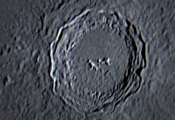
Image Credit: Geoff Lewis
Whilst not a bad image, I just could not get it to sharpen as much as I wanted and on closer inspection could see that the 3 colour channels were not well aligned, but try as I might I just couldn’t fix it.
A couple of days later my friend Dave Tyler sent me some images that he’d taken the same night including a wider field view of Copernicus using his vintage 7” Astro Physics APO, a x2 barlow and his ZWO video camera. I sent him mine by return and during the ensuing emails and conversations Dave suggested that I use only the red channel from my image converting it to mono grey channel, as colour dispersion particularly on the blue channel was ‘ruining’ my image.
Interested to see how each channel compared I used ImagesPlus to split my aligned and combined colour data into the 3 R, G and B colour channels, then applied identical smooth, sharpen and curves (brighten and contrast) processes to each image. The results are below, from which it can clearly be seen just how much the blue channel image on the right is out of focus when compared to the red and green channels, with the red channel just slightly more in focus than the green.
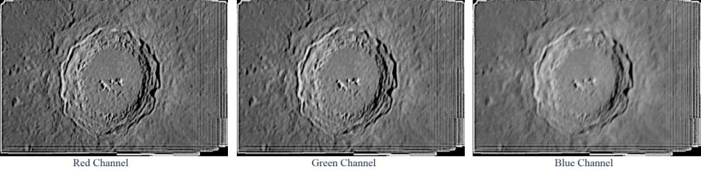
Image Credit: Geoff Lewis
Please also note that I have deliberately left all the alignment edges in each image to show just how much the image was moving around on the camera chip and what a great job Autostakkert did of aligning the approximately 1200 best frames from the 4000 total frames in the video file.
We all understand that white light is made from all of the visible electromagnetic wavelengths, which for most purposes is broken down into red, green and blue. However, what may be less clear is how Earth’s atmosphere acts as a lens such that when looking at or imaging stars, planets and the moon, the resulting refraction not only causes dispersion such as we see in rainbows, but also alters the focus point of all the wavelengths. Hence colour imaging through Earth’s atmosphere is inherently fraught with difficulty in obtaining good focus, especially on the larger Solar System targets such as the Moon, Jupiter and Saturn.
Having established that the red channel was the best focussed channel I proceeded to complete the processing of the image to produce the below mono image of Copernicus.
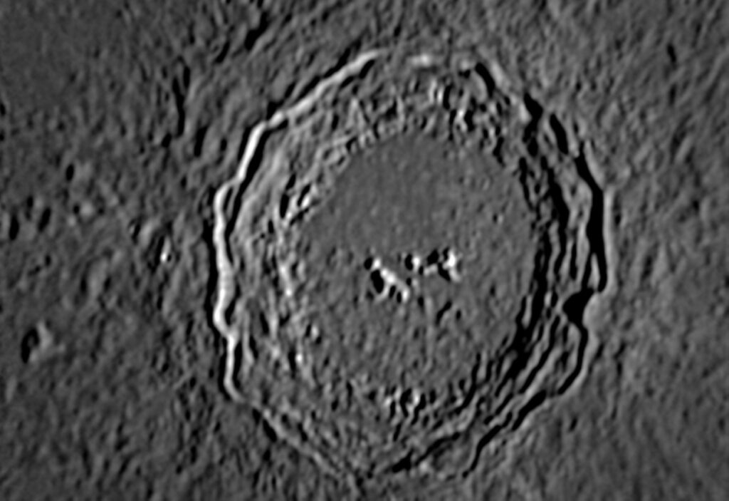
Image Credit: Geoff Lewis
The differences are subtle, but hopefully you will agree that it was worth the additional processing step.
The next pair of images are ones that Dave Tyler produced being composites of both of our images. The one on the left has his rescaled up to match mine the other with mine rescaled down to match his. In both cases my image was then overlaid on his so that the two crater images may be compared side by side. This is hardly scientific, but maybe it contributes to the debate about telescope type (refractor v reflector), sizes and performance, plus the use of Barlow lenses to increase focal length and hence image size on the camera’s sensor.
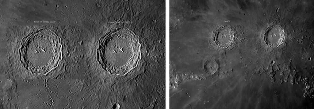
Image Credit Geof Lewis
Considering that Dave Tyler was using a 7″ F9 APO with a x2 barlow (hence F18) and I was using a 10″ (centrally obstructed) SCT with a x3 barlow (F30) and that we were using camera’s with different size chips, can you tell the difference? Dave’s configuration certainly gives a much larger field of view (FOV), but even when rescaled up to the smaller FOV of my set up the difference in image quality between them is marginal. As I stated, hardly a scientific study, but interesting and fun to do.
Finally I have set out below two other lunar crater images that I took the same evening, both of which have been processed as mono images using only the red channel extracted from the colour data.
The first image is of Plato.
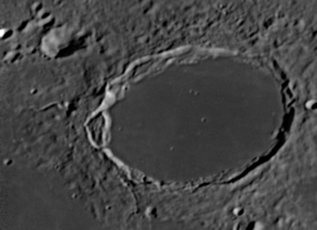
Image Credit: Geof Lewis
The final image is of the two craters Campanus and Mercator.
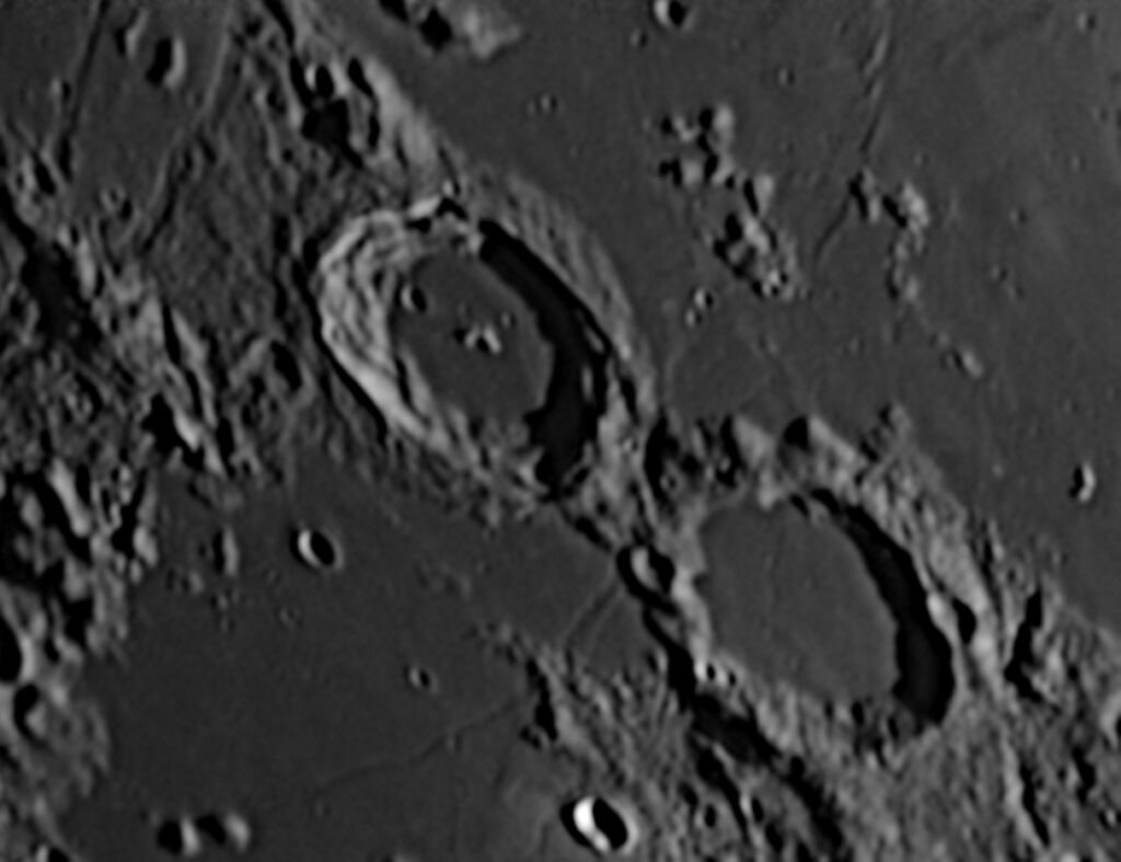
Image Credit: Geof Lewis
Plato is some 109km in diameter and is actually circular, appearing oval due to foreshortening as it is closer to the pole than Copernicus; Copernicus has a diameter of 93km. To give some context to the size of these craters, the diameter of the M25 London orbital road is approximately 40-50 miles (64-80km), so all of London out to and beyond the M25 would comfortable fit within each of these craters.
By Geof Lewis
Feb 2015